The Bertazzoni world seen through Italian Bark’s eyes
Elisabetta Rizzato is an architect with a passion for interior design. She loves to travel around the world and discover new styles and designs while talking about Made in Italy on her blog Italian Bark. Four years ago she opened this portal where she gathers ideas, inspiration and the latest trends on how to make a home unique. She told us what she loves about Bertazzoni and gave us some advice on how to furnish a kitchen.
How did your collaboration with Bertazzoni start?
My blog about interior design, as the name says, was born from the desire to speak about the Italian aesthetic abroad, to go beyond Italian borders thanks to the web while keeping an Italian identity.
In that sense, there’s a sort of parallelism with the company, which keeps a strong Italian tradition but speaks to a client base without geographical borders, with ranges which are adaptable to the technical needs of different countries without losing their distinctive traits and a strong and recognizable Italian style.
This is why I got the idea to talk about Bertazzoni through a journey in different countries: the kitchen is the heart of the home, the room where it’s easiest to identify the cultural peculiarities of a country as opposed to another. Mine is a tale between design and travel, rather like my blog.
Needless to say, as an architect and interior designer, I’ve always appreciated Bertazzoni’s kitchens both for the quality of their materials and their ranges: an example of excellence of our country, which I’m proud to share with my readers!
What impressed you the most about the company?
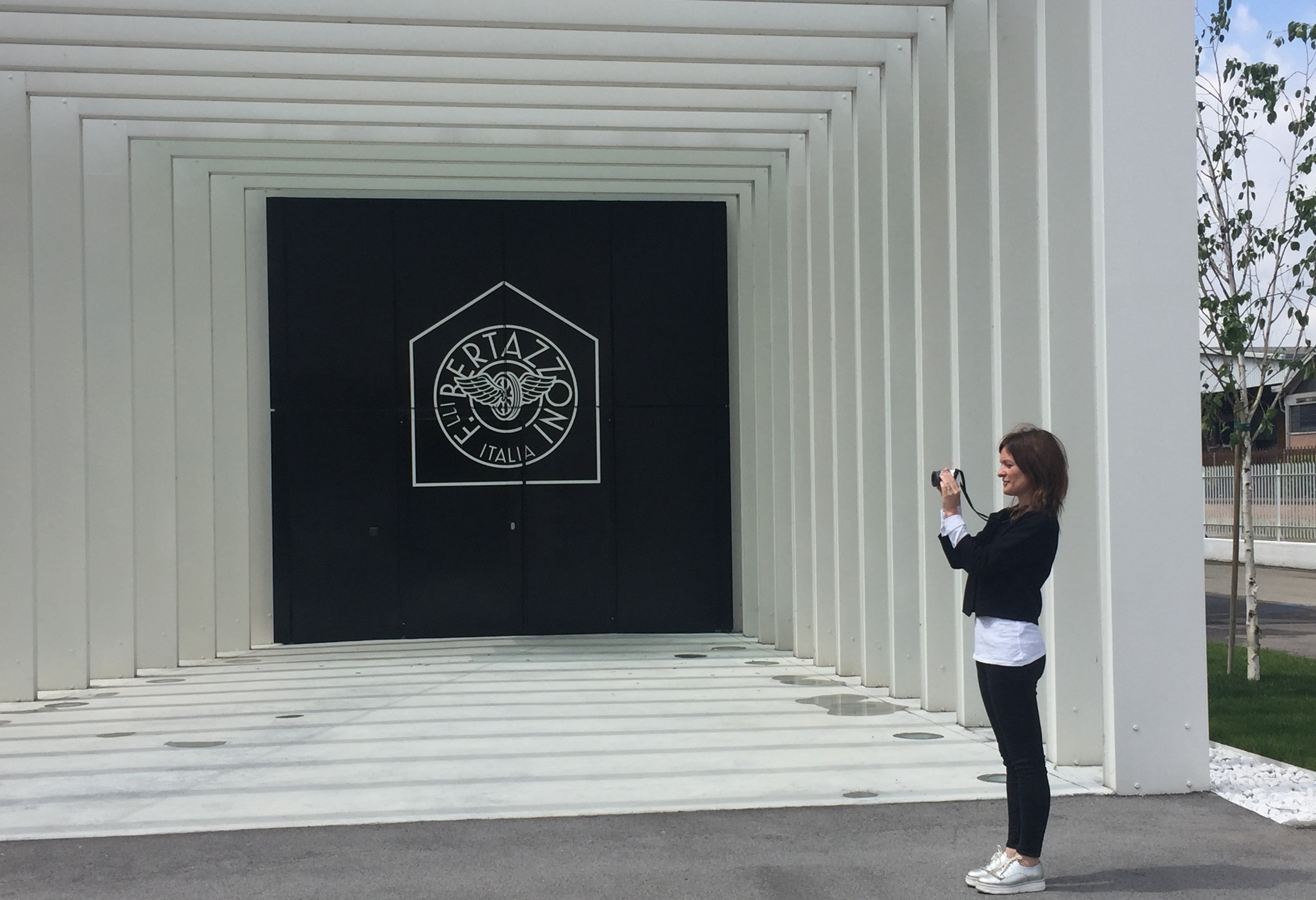
I’m intrigued by the company’s history and its bond with its country, which to this day remains one of the fundamental values of the brand, even though Bertazzoni’s products are allover the world! I remember that during my visit at your headquarters in Guastalla I was impressed from the start by the history of Bertazzoni’s logo, trademarked in 1923 but still very modern: this is proof on one hand of the company’s vocation, which has always been characterized by a modern attitude and an ability to “look forward”, on the other hand of a journey characterized by a great consistency in regards to its history and origins.
Based on your experience as an architect and interior designer what makes Bertazzoni’s products stand out? How would you define their design?
I would say that Bertazzoni’s ranges are modern but also timeless. A Bertazzoni kitchen is designed to last a long time, not only in terms of materials but also in terms of design. This means that they don’t follow current trends, but have a unique and recognizable style, even when placed in spaces very different among themselves.
What’s the style of your dream kitchen? Minimal, country or traditional?
My dream kitchen has a minimal style and its main objective is practicality.
For me a kitchen must be beautiful, of course, but most of all it must be practical and functional. When I say practicality I mean an optimal management of the space, which right now in my home is very limited, even if it would be the same also in my ideal home: in my dreams there’s a small house immersed in the green. I don’t like big houses and am fascinated by solutions that take advantage of spaces in smart and creative ways. As a traveller, I would even dream to live in one of those compact homes that can be moved wherever you want!
Do you have some advice on how to furnish the kitchen for those who own a Bertazzoni?
My advice is the one I would give to any person who owns a design piece: “less is more” is alays a good principle to enhance everything, that’s to say proceeding by subtracting things in order to highlight a piece of furniture in the best possible way. In this sense, Scandinavian kitchens are a fantastic example. I suggest you to follow Bertazzoni on Instagram to find many ideas and inspirations!
What’s your favorite color amongst those offered by Bertazzoni?
I love glossy white; it’s what I would like for my own kitchen. Among brighter colors I would choose red because it’s very graphic and it’s actually very easy to combine with other colors.